
Bluescape platform redesign

Bluescape is a cloud-based visual collaboration platform serving enterprise, government, education, and media & entertainment customers worldwide. I joined as Principal UX Designer and Team Lead in 2018, when the product was capable but early-stage. I left in 2024. In between, we rebuilt most of it.
The Challenge
Three pressures arrived at roughly the same time. The visual collaboration market was consolidating fast: Miro and FigJam were eating into Bluescape's market position, and the broader SaaS ecosystem was raising the visual and interaction bar across the board. Enterprise customers were demanding admin capabilities the product wasn't architected to support: SCIM provisioning, SSO, hardware management, third-party integrations. Federal agencies, by then a significant and growing part of our customer base, required Section 508 accessibility compliance and FedRAMP certification as a condition of purchase.
Each of these was a substantial design problem. Together, they defined six years of work.
My Role
I was responsible for both the design output and the team producing it. Managing an 8-person design team across North America and Europe meant grooming backlogs, allocating work by skill and availability, communicating status to senior leadership, and supporting 3 agile squads in parallel.
The day-to-day of team leadership doesn't diminish the design work. It shapes it. Knowing what your team can realistically deliver changes how you scope design problems, and having to make design decisions legible to senior leadership makes you sharper about what actually matters.
The Process
Competing with Miro and FigJam
The platform redesign wasn't a single project. It was a continuous response to a market that wasn't standing still. We interviewed customers, ran competitive analyses, and used what we learned to prioritize where the product needed to move. The goal wasn't to match Miro feature-for-feature, but to ensure Bluescape had a clear and defensible position, particularly in industries like M&E and government where the collaboration model was different enough to matter.
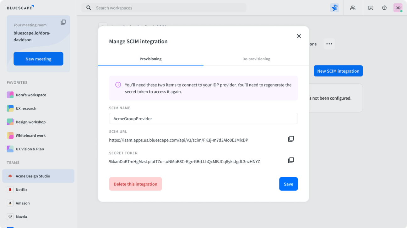
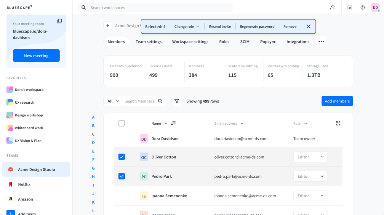
Rebuilding the Config Centre
The existing administration experience was piecemeal: features added as customers asked for them, without a coherent platform underneath. We redesigned it from the ground up, creating a proper admin platform that could support SCIM provisioning, SSO configuration, hardware management, and third-party integrations. The primary users were IT admins, and we approached it the same way we approached any design problem: by understanding what they were actually trying to do before designing the interface.
The Accessibility Initiative
Getting to 94% WCAG 2.1 Level A and AA compliance meant more than design work. It meant convincing the organization that accessibility wasn't a nice-to-have. It was a business requirement. Federal agency customers needed a Section 508 VPAT as a condition of purchase. FedRAMP certification was a strategic goal. I championed the initiative, built the case internally, and managed a team of engineers and QA specialists through the remediation process. Eighteen months later, we had a VPAT that scored 94% compliance.
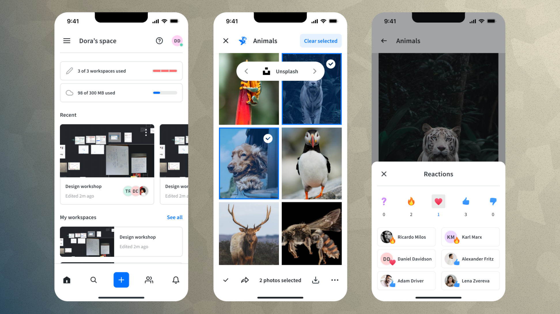
The Mobile Companion App
This is what I'm most proud of from six years at Bluescape.
When I joined, the mobile app was trying to be a full-featured replica of the desktop product. The assumption baked into that decision was that more features meant more value. The data told a different story, except we didn't have much of it. Third-party analytics platforms didn't meet the security requirements of our enterprise customers, and were outright banned for our federal agency clients. That meant we were designing without the quantitative usage data most teams take for granted. So we went to the source: customers.
What we heard was clarifying. Most customers didn't know the mobile app existed. Of those who did, the experience frustrated them. The reason was structural: Bluescape's infinite canvas is designed for large screens with abundant real estate. On a phone, that same canvas becomes a navigation problem. Users spent most of their time zooming, panning, and hunting for content rather than doing anything productive. When we asked whether they'd use desktop-equivalent features on mobile if we built them, most said no. The problem wasn't missing features. It was the wrong mental model for the form factor entirely.
The real insight came from pushing deeper into what people actually did, or wanted to do, on their phones during a Bluescape session. The answers clustered around a handful of high-value, low-friction actions: joining an AV call, following along with what someone else was presenting, dropping a comment, placing a sticky note. These were tasks that fit the phone's form factor naturally. They didn't require navigating the infinite canvas. They required presence and lightweight participation.
That reframe changed everything. The mobile app didn't need to do less of what the desktop did. It needed to do something different entirely: be a companion that kept people connected to a session without requiring them to navigate a workspace that was never designed for a four-inch screen.
Convincing leadership to let go of parity as a goal required making that case explicitly. Parity felt safe because it was measurable: feature X exists on desktop, therefore it should exist on mobile. The companion model required trusting that doing fewer things better would serve users more than doing everything poorly. The customer research made that argument possible. Without it, the conversation would have stalled on the feature checklist.
The result was a mobile experience built around presence, participation, and lightweight contribution. Whether that translated to measurable retention or engagement improvements is something we couldn't fully quantify given our analytics constraints. But qualitative feedback from customers shifted noticeably: the app went from something most people didn't know existed to something they referenced as a reason Bluescape worked better in their workflows.
Outcomes
The VPAT wasn't just a compliance milestone. It was a commercial one. Federal agency customers who were previously ineligible to purchase the product could now evaluate it. Accessibility became a sales asset.
Reflection
Six years is long enough to see the full arc of decisions play out. Bluescape in 2024 bore almost no resemblance to Bluescape in 2018. Not because we started over, but because we kept asking the right questions and being willing to change our answers. The mobile companion app is the clearest example: it took real conviction to let go of parity as a goal. But that kind of conviction is what design leadership is actually for.
The accessibility initiative taught me something different: design's influence in an organization extends well beyond the screen. Changing how an engineering team thinks about accessibility, and having that change reflected in a VPAT that unlocks new customer segments, is as much a design outcome as any interface we shipped.