
Bluescape Electron app
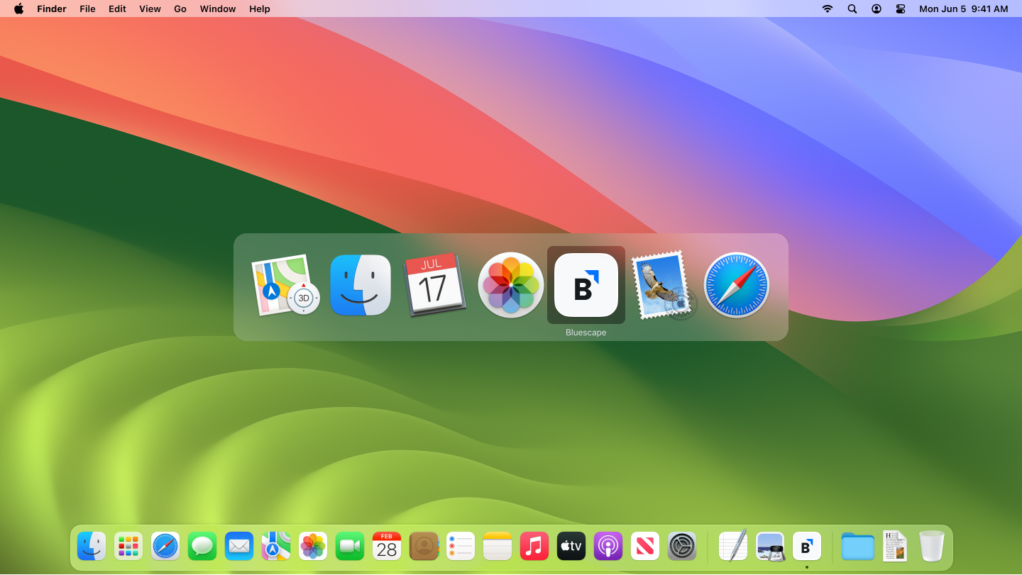
Before the Electron app existed, deploying Bluescape on a large-format touchscreen meant procuring a bespoke Linux controller, having it configured in-house for the customer's specific monitor setup, shipping the hardware to site, and then either coaching the customer's IT team through installation or sending one of our own technicians to do it. Every deployment was a project.
The Electron app changed that. A standalone Windows client that matched the web platform's capabilities, it decoupled Bluescape from proprietary hardware entirely. Customers could now run it on any Windows machine attached to any monitor they already owned, deployed through their enterprise app centre or installed directly. What had been a hardware procurement and logistics problem became a software decision. That's what it unlocked.
Zero-to-one desktop client. Shipped from scratch. Eliminated a custom hardware supply chain. Opened enterprise deployment to any Windows infrastructure. Added a Microsoft Teams integration.
The Challenge
Bluescape's large-format touchscreen experience had previously required proprietary hardware: the software came preloaded on the device, and the whole unit shipped together as one. This locked the product out of enterprise environments where IT controlled the hardware stack, complicated sales cycles with hardware procurement, and made every new customer deployment a logistical undertaking.
The opportunity was straightforward: build a software client that could run on any Windows machine, from a standard desktop to a small-form-factor PC attached to any large-format monitor the customer already owned. One app. Any hardware. Any deployment model the customer's IT team preferred.
My Role
This was a ground-up design effort. There was no existing app to iterate on. We were bringing a new product category to market from zero.
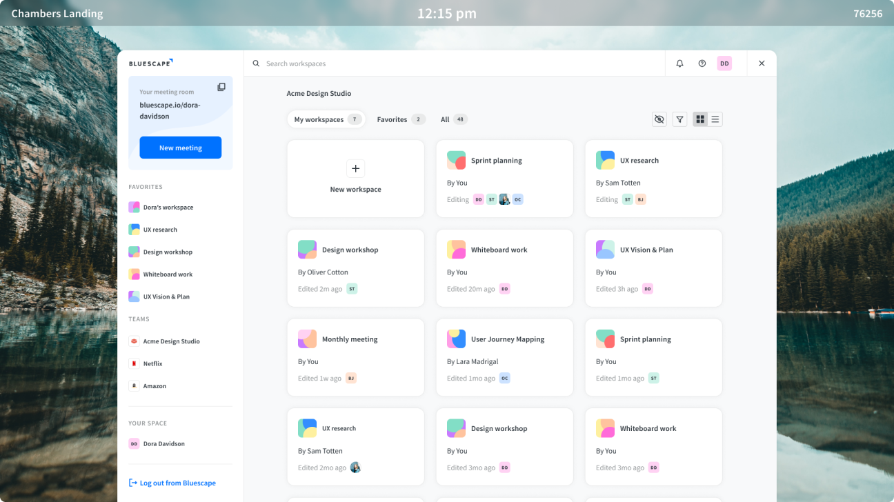
From an engineering standpoint, the Electron app was a branch of the main web application rather than a separate codebase. That was a significant win for the team: whatever shipped on the web platform was available on the wall client automatically, with no parallel maintenance burden. My job was to design the delta, the interaction model and the features specific to the wall client context, while ensuring the experience remained consistent with the web platform and mobile app that enterprise customers already knew.
That delta was substantial.
Authentication and walk-up sessions
These devices lived in shared spaces: meeting rooms, reception areas, breakout rooms, team areas. The product needed to support walk-up sessions where anyone could start a collaboration workspace without logging in, while also supporting authenticated shared device logins for environments where access to proprietary internal content needed to be controlled.
Claiming a workspace under time pressure
When a session ended, users needed a way to take ownership of that workspace quickly. In practice, this wasn't a leisurely flow. Meeting rooms turn over fast, and the next group is often waiting outside. Everything created during that session needed to be claimed and carried before the room changed hands.
We solved the handoff with two parallel mechanisms: a keyphrase code and a QR code. The reason for both was a hard constraint: several customers, primarily in government and defence, did not permit mobile phones in rooms where the wall client was running due to classified content. The QR code alone wasn't sufficient. The keyphrase gave those users a path to claim their workspace from the My Bluescape web page without a phone. Both mechanisms resolved to the same ownership transfer. The path depended on what the customer's security policy allowed.
Tabbed workspaces at wall scale
Feature parity with the web platform introduced its own constraints. Tabbed workspaces, the ability to have multiple workspaces open simultaneously much like browser tabs, were a core part of the web experience. On a laptop or desktop, tabs along the top edge of the screen are a familiar and reachable pattern. On a wall-sized display, the top edge is out of reach entirely.
We moved the tabs to a left-side rail. That kept the functionality intact and put it within reach regardless of where someone was standing. It was the kind of decision that sounds simple in hindsight but required letting go of the convention entirely and asking where the pattern actually needed to live for this context.
Multi-server provisioning
Customers with multiple servers, each with their own security requirements, needed the app to know which server to point to on installation. We designed the provisioning and configuration flows to handle that without requiring IT to manually configure each device.
The Process
Defining What Needed to Change
The Electron app intentionally mirrored the web platform's feature set. Parity was correct here: the app's role was a deployment vehicle, not a distinct product. What changed was the interaction model. These devices were primarily used as large-format touchscreen monitors in conference rooms, running off small headless PCs attached to the back of the display. Cursor-driven UI patterns from the web don't transfer cleanly to a screen you're touching with your fingers while standing up.
Adapting for Touch and Scale
Hit zones had to grow. Navigation patterns had to accommodate fingers rather than cursors. Keyboard input, via external keyboard or on-screen, needed to integrate naturally. The challenge was making those adaptations without creating an experience that felt inconsistent with the web platform, because many users moved between both.
The reference point that helped most wasn't the web. It was mobile. Users already knew how to interact with touch interfaces from their phones and tablets. Making the wall client interaction model congruent with the mobile experience meant borrowing established conventions rather than inventing new ones. That decision shortened the learning curve significantly and set the foundation for the more sophisticated touch work that followed.

Outcomes
The Electron app replaced a custom hardware supply chain with a software download. Enterprise IT departments could now deploy Bluescape on infrastructure they already owned and controlled, through the channels they already used. Procurement became a software decision. Installation became a standard IT task rather than a specialist engagement.
It also opened the product to a category of customer that the hardware-bundled model had excluded entirely: organisations where IT controlled the hardware stack and bespoke Linux controllers were never going to clear procurement. The Electron app made Bluescape a viable option for that customer. That's a market expansion, not just a UX improvement.
Reflection
Designing a product that doesn't exist yet forces a kind of clarity that iteration doesn't. Without an existing interface to anchor against, every decision is explicit. You can't fall back on "that's how it's always worked." The Electron app was the first time I worked at the intersection of desktop and large-format touch design, and it established the principles, congruency with mobile, touch-first hit zones, reachability as a constraint, that shaped all the wall client work that followed.