Bluescape touch screen clients
The Bluescape touch screen clients brought visual collaboration to wall-scale. 74 to 104-inch monitors, mounted in conference rooms, classrooms, situational awareness centres, and production suites. Configured as single displays or arrayed 2×2 and 3×3. Designing for that context meant rethinking interaction design from first principles. It produced one patented interaction along the way.
The Challenge
Scale changes everything in interface design. A toolbar at the top of a standard monitor is always within reach. On a 104-inch wall display, that same toolbar is physically unreachable for many users. Hit zones sized for a cursor are too small for a fingertip. Presentation mode means clearing all UI chrome; users still need a way to restore it, wherever they happen to be in the workspace.
The users were as varied as the environments: enterprise meeting attendees, room facilitators, teachers, post-production teams in the M&E industry, and analysts in government situational awareness rooms. Some were highly technical. Most just needed to collaborate. All of them were on their feet.
My Role
I led the interaction design for the touchscreen clients, working closely with engineering to translate the interaction model into working software. This included defining touch-specific UI patterns, validating them on real hardware configurations, and driving the design of the Summon-to-Me interaction, which was ultimately patented.
The Process
Touch-First UI Patterns
Everything had to be sized and positioned for fingers, not cursors. Hit zones expanded throughout the interface. Navigation was restructured for standing users who might be at arm's length from the display or further. Stylus input was supported for precision work, particularly relevant for M&E customers doing annotation and markup. External keyboards are integrated naturally for text-heavy tasks, with an on-screen keyboard available when needed.
Reachability was the central constraint. On a 3×3 array of 86-inch monitors, the total display area is simply larger than a person can reach standing in one place. UI fixed at the edges of that canvas stops being useful for users working in the middle of it. The design had to account for human physicality in a way that desktop and web design never need to.
From One Codebase to One Problem
The wall clients didn't start as a separate product. They started as a platform decision.
Bluescape's early hardware approach, proprietary Linux-based systems with custom software loaded at the factory, was untenable at scale. The margins were thin, the QA burden was high, and being in the hardware business meant being responsible for everything that could go wrong between manufacturing and installation. The strategic move was to rebuild the client on Windows, enabling it to run on any certified touchscreen hardware. One codebase. Lower overhead. Wider install base.
That decision solved a business problem and created a design one.
The Windows client was designed for a desktop monitor: toolbars at the top, navigation on the left, secondary controls in the bottom right. On a 27-inch display with a mouse, that layout worked fine. On an 86-inch wall display, with a person standing in the middle of the room, half the UI was physically out of reach. The top toolbar might as well have been on the ceiling. The bottom right controls required walking to the corner of the screen.
The obvious solution was a separate UI for wall deployments. A fork. Wall-specific layouts, wall-specific hit zones, wall-specific everything. We looked at that option and immediately saw what it would cost: duplicate design work, duplicate QA, diverging codebases, and an ongoing maintenance burden every time either version changed. It was the right solution to the wrong problem.
The right problem was simpler: people couldn't get to the UI from wherever they were standing. What if the UI could come to them instead?
Summon to Me
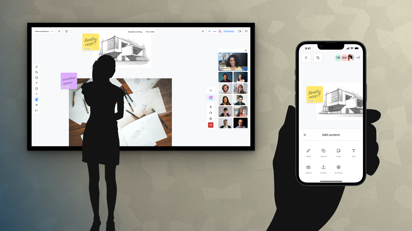
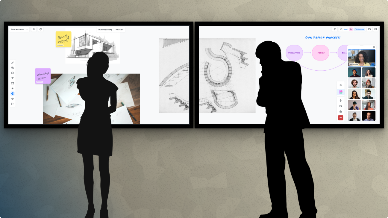
The Summon to Me interaction was our answer to the reachability problem. A long press anywhere on the workspace brings all the UI toolbars to gather around the user's fingertip, wherever they're standing and wherever they're pressing. This means a user can clear all the interface chrome and go into full presentation mode with the canvas, then summon everything back to exactly where they need it without walking to a corner of the screen.
The idea came directly from the constraint. A forked codebase was the expensive, obvious answer. A single interaction that moved the UI to the user was simpler, cheaper, and more elegant. We built it, shipped it, and our CTO suggested we patent it. We did.

A/V Integration
The touch clients also incorporated a swappable A/V architecture that allowed organizations to bring their existing meeting solutions, Zoom, Teams, or whatever platform they were running, directly into the Bluescape interface. The design challenge was making that integration feel native: not a separate tool bolted on, but a natural part of the collaboration surface.
Outcomes
The touch clients were deployed across enterprise conference rooms, university classrooms, government situational awareness rooms, and production suites at major M&E companies. The Summon to Me patent stands as one of the most concrete outcomes of design work I've been part of: an interaction that started from a genuine user problem with no obvious solution, and ended up protecting a novel approach to a problem nobody had solved before.
Reflection
Designing at the wall scale forced me to think about human physicality in a way that screen design rarely does. The body matters. Where people stand, how far they can reach, whether they're tall or short. These are real constraints the interface has to work around.
The Summon to Me story also reinforced something about design constraints I've come back to many times since: the best solutions often come from taking the constraint seriously rather than working around it. A forked codebase would have solved the reachability problem. It would have created ten others. Staying within the constraint of a single codebase forced us toward something more inventive and more durable.
The core insight seems obvious once you've solved it: when the screen is bigger than your reach, the UI has to come to you. It wasn't obvious at the start. It came from spending real time with the hardware, watching people use it, and being willing to invent something that hadn't existed before.