
Lexful

Lexful is an AI-first documentation tool built for Managed Service Providers. I joined as founding design partner in September 2025, with a brief to take the product from zero to one. Five months later, we launched with eight design partners, over a hundred founding circle members, and another hundred in the pipeline. This is the story of how we got there.
The Challenge
The MSP documentation space is well-established but underserved by modern tooling. The opportunity was to build something genuinely AI-native. Not a legacy tool with AI bolted on, but a product designed from the ground up around how AI can make documentation faster, smarter, and more useful for the people doing the work.
The challenge from a design perspective was twofold: move fast enough to validate assumptions with real customers, and build a foundation robust enough to scale when those assumptions proved out.

My Role
As the founding design partner, I was responsible for the full scope of product design. That meant everything from sitting with customers and synthesizing what they told us, to defining the interaction model, to building the design system that the engineering team would build against. I was also involved in shaping the product strategy, identifying design partners, and contributing to product-led growth thinking.
There was no design team. It was a founding environment, which means every decision mattered and nothing could be precious.
The Process
Listening First
We started with customers before we built anything. I led a series of design partner interviews to understand how MSPs were currently handling documentation, where the pain was, and what they actually needed versus what they said they needed. Those conversations shaped everything that came after.
Rather than manually synthesizing hours of customer meetings, we used AI to identify patterns across conversations quickly. This let us move from customer insight to product decision in days rather than weeks, and meant we could run more conversations without losing fidelity.
An AI-First Way of Working
AI wasn't just in the product, it was in how we built the product. We used it to synthesize meeting notes, surface recurring themes across customer conversations, and rapidly prototype responses to what we were hearing. The goal was always the same: get something in front of customers as fast as possible, learn, and iterate. In a five-month runway, that pace is the only thing that works.

Building the Design System
One of my first substantive decisions at Lexful was to build a proper design system before building the product. In a founding context, the instinct is always to move fast and clean up later. I've seen what that costs, and I made a different call.
The Case for Building It First
In a founding environment, the conventional wisdom is to move fast and build the system later. Ship first, clean up when the team grows. I've seen how that plays out: by the time the team is big enough to feel the pain, the product is too far along to fix without stopping everything. The system gets deferred indefinitely, and every new feature compounds the debt.
My read on Lexful was different. This product had real momentum. Eight design partners before launch, a hundred founding circle members, another hundred in the pipeline. That's not a slow-burn product, that's something that could scale fast. And scaling fast without a system underneath it is how you end up with three designers making inconsistent decisions across a product that customers are paying for.
Building the system first wasn't the cautious choice. It was the aggressive one. It meant every feature we shipped after that was building on a foundation that could scale, and engineering never had to wait for a design decision that should have been made in the system already.
The system was built in two layers. The Brand collection defined the primitives: full color scales for every hue (50 through 950, in both light and dark mode), typography families, font weights, and spacing values. These are the raw materials, the values with no opinion about where they get used.
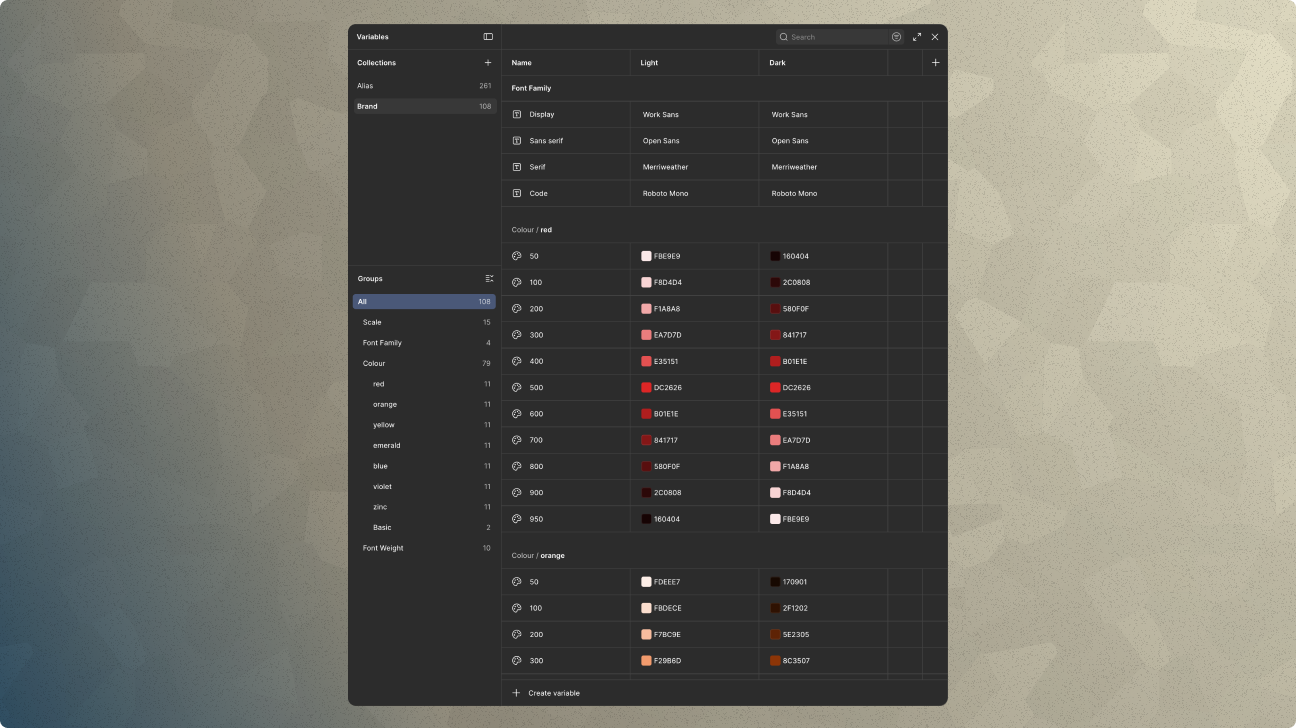
The Alias collection mapped those primitives to semantic names that reflected intent, not value. Text/Primary, Text/Disabled, Primary/Button/Default, Primary/Button/Hover, and so on. Each token resolves to a specific Brand token in both light and dark mode, so a single design decision cascades correctly across both themes without manual intervention.
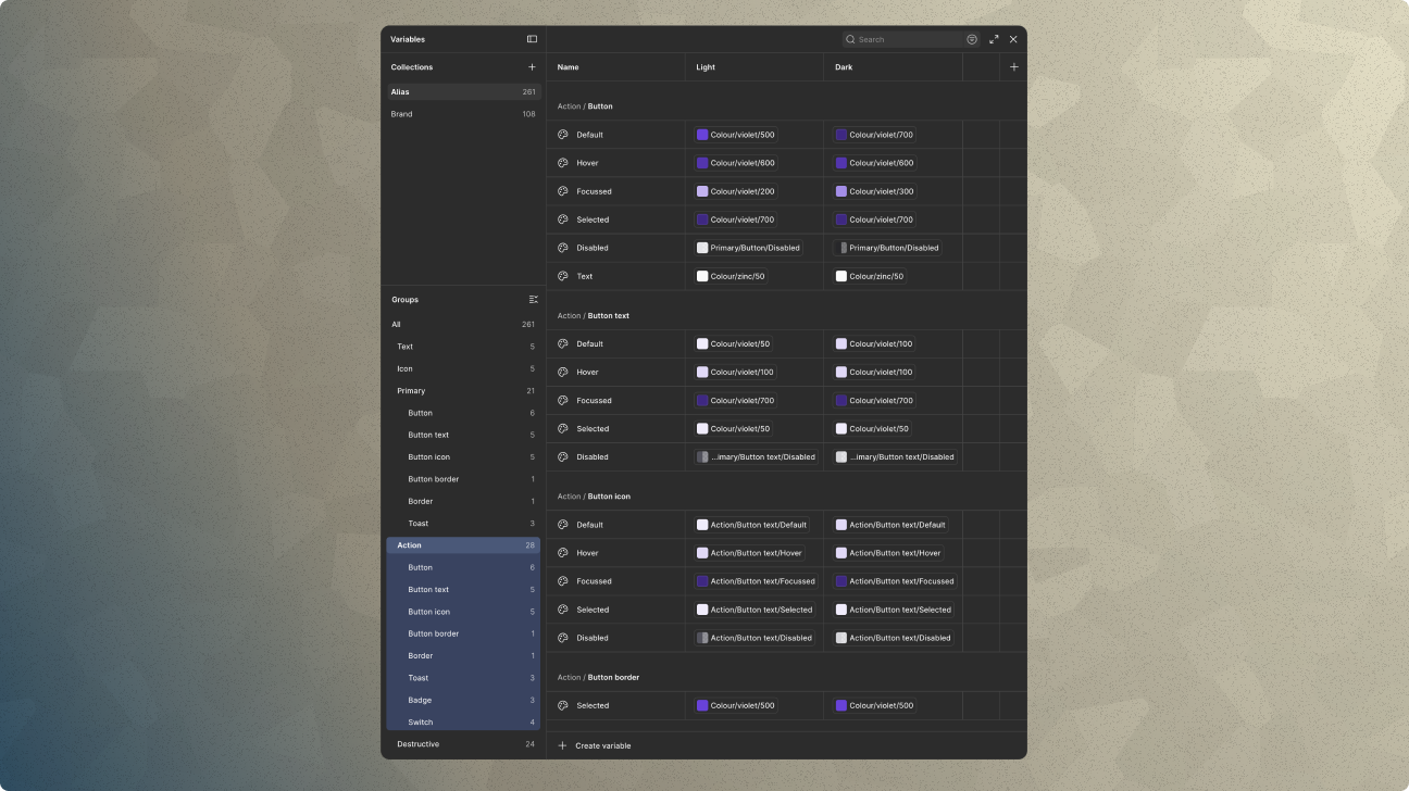
Crucially, the semantic naming was structured to mirror the ShadCN component library the engineering team was building against. That alignment wasn't cosmetic. It meant the design system and the component library were speaking the same language, and a decision made in Figma translated directly into an engineering decision without negotiation or interpretation.
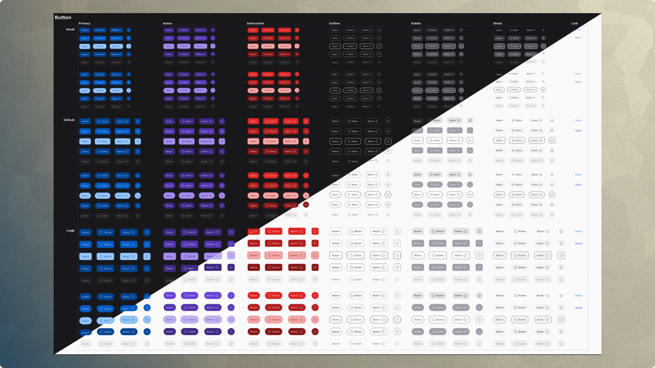
The component layer built on top of that foundation. Every component was built with conditional logic around states, sizes, and variants, fully expressed in the token system. The button family alone covers seven variants, three sizes, and five interactive states, all resolving through the token chain in both light and dark mode.
Why this matters beyond efficiency
A design system built this way has a third audience beyond designers and engineers: AI-assisted design tools. When a component is named Primary/Button/Hover and resolves through a documented chain to Colour/blue/600, that chain of intent is legible to any tool that needs to reason about the system, not just reference it. At Lexful, that was a deliberate architectural decision. We were building an AI-first product, and we built the system the same way.
The practical result: when engineering needed a new component or pattern, the design decision was already made and documented. No back and forth, no inconsistency, no debt. And as the product scaled, the system scaled with it.
Outcomes
Those numbers represent real customers who believed in the product enough to commit before it was finished. That doesn't happen without a product that feels considered and trustworthy from the first interaction.
Reflection
What this project reinforced for me is that design's highest leverage in a founding context is not the screens. It's the decisions you make about how to listen to customers, how to translate what you hear into product direction, and how to build systems that let a small team move at a pace that would otherwise be impossible. The screens matter too, but they're downstream of everything else.
Building AI-first isn't about adding AI features. It's about designing a product and a process where AI is embedded in how value gets created: for the customer and for the team building it.